Tuesday, January 9, 2018

Understanding The 29 In-built Power BI Visuals And How To Access Additional (Custom) Visuals

Power BI visuals are the actual elements — tables, charts, filters/slicers, maps, etc — that present the data in your report. By default, Power BI comes with 29 visuals.


They are:

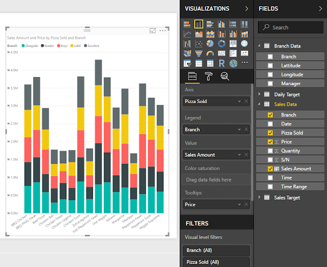
1. Stacked Bar Chart: This allows you to create a bar chart with the breakdowns (field in legend) stacked on top of each other. It can be used to show total sales with breakdown by products or region. It has five components — Axis (where you put the field that should have separate bars, like date), Legend (where you put the field to stack one on another for each category in the axis, e.g. products or regions; anything you drag into Legend comes out with different colors), Value (where you put the field with the figures you want to plot), Color Saturation (allows you to represent the values in a field on a light to dark color intensity on the plotted value bars. You can’t use it and Legend together. A likely use will be to show volume/quantity of products sold while the bar values present the sales amount), and Tooltips (allows you to show extra details, like price per unit of the product).


2. Stacked Column Chart: Technically same as the Stacked Bar Chart just the orientation is different, its bars are vertical.


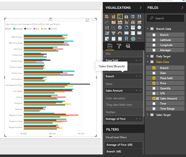
3. Clustered Bar Chart: The difference between this and the stacked one is that it has the breakdowns (legend values) plotted on independent bars rather than stacked one on another.


4. Clustered Column Chart: The difference between this and the stacked column chart is that it has the breakdowns (legend values) plotted on independent bars rather than stacked one on another.


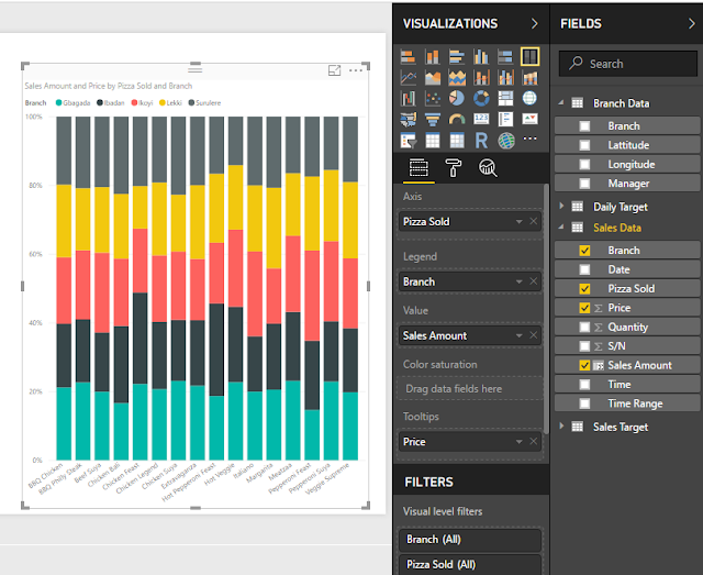
5. 100% Stacked Bar Chart: This has the legend values (breakdown) expressed as percentages of the total value per axis item. Useful for showing relative contribution of sales by the different branches to total sales each day/month. And if you work with market research data, excellent for market share representation.


6. 100% Stacked Column Chart: Just as you would have guessed, it is the column version of the 100% Stacked Bar Chart.


7. Line Chart: Has all the components of the Bar/Column chart except the Color Saturation one. The line chart is to show trend (change over time), so you should always put a date or time field in the Axis.


8. Area Chart: It is very much like the line chart but with the area under the lines shaded. Has same components as the line chart.


9. Stacked Area Chart: You already know area chart, this is when you stack the legend entries one on another.


10.        Line and Stacked Column Chart: This is just combining line chart with column chart in the same visual. It is what we call Combo Chart in Excel and can be useful for showing two distinct insights in one visual — like the gross margin as a line chart and the revenue as a column chart over a period of time.


11.        Line and Clustered Column Chart: Again, just like the line and stacked column one except that the columns aren’t stacked.


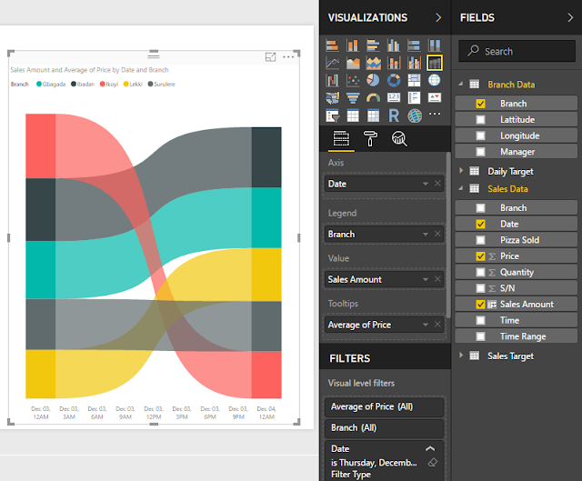
12.        Ribbon Chart: This chart is a lot like the area chart but with the added advantage that it makes it easier to see the changes in the values of the entries in the legend.


13.        Waterfall Chart: This chart is for showing the movement in a metric over a period of time, emphasizing the initial value and the end value. It is a beloved chart of finance analysts, it is often used to present changes in a company’s cashflow from opening cashflow to closing cashflow over a reporting financial period.


14.        Scatter Chart: This chart is for showing the relationship between two variables. That is why it requires you put a field in X-axis and another in Y-axis. And it can also serve as bubble chart, you only need to drag the field to determine the bubble size into Size.


15.        Pie Chart: This chart shows relative contribution of entries in the field put in the Legend to the field put in the Values. You can also put a field with additional useful information in the Details.


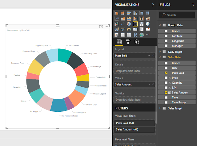
16.        Donut Chart: It is exactly pie chart but with the traditional donut hole.


17.        Treemap: This chart shows relative contribution but unlike pie chart that fits everything in a big circle this one fits everything in a resizable rectangle.


18.        Map: The name is very self-explanatory. Normally, you would drag countries/cities or any location field to Location but if the locations are not very popular places you might need to get the GPS coordinates and place in the Latitude and Longitude.


19.        Filled Map: It is like the Map but fills the entire location area on the map taking the shape of the country/state/city.


20.        Funnel: This chart is best for stage-like fields and values. Popular for sales conversion records. You can put the sales/conversion stages in the Group.


21.        Gauge: This chart is great for showing the values against target on a gauge-like scale. And you can set the dimensions (minimum and maximum of the scale).  It is one of the few visuals that allow you to set an alert on in the published Power BI dashboard


22.        Card: It displays just one thing. Can be very useful for showing total sales, KPI figure and counts (like number of stores or orders). It is also one of the visuals that allow you to set an alert on it in the published Power BI dashboard.


23.        Multi-row Card: It is like card with extra features — ability to display values of more than one field. An example is sales by branch.


24.        KPI: It shows the variance between a value and its set target. Very useful for key performance indicators (KPIs).


25.        Slicers: I often call them nicer filters. Work exactly as a filter.


26.        Table: It is an intuitive table that aggregates the fields you put in intelligently.


27.        Matrix: It is exact replica of PivotTable. We have already used it in the last sample project.


28.        R Script Visual: This allows you to run R scripts in Power BI. Might be of particular interest to people already proficient in data analysis using R.


29.        ArcGIS Maps for Power BI: This is very much like Map but with some peculiar features you might find very useful.


Lastly, Power BI allows you to access more visuals to use in your reports via Custom Visuals on the Home menu.


Tuesday, January 2, 2018

Sample Power BI Project On Analysing Sales Data By Branch, Product And Target

For this sample project, we are going to build a Power BI report and dashboard for Domino’s Pizza. I have gotten some fictitious data on their branches in Nigeria, two weeks sales data, daily target figures and product target figures for the period under analysis.

I have the data exported as Excel files. You can download the practice along files at https://drive.google.com/file/d/1FCEkyJvW4viszv9wo43QaljXI2ADpCDD/view?usp=sharing 


Making sure the Excel files are closed, we are going to use Power BI’s Get Data to bring in the data. If you have the startup screen then you can locate the Get Data on the top left.


But if you are on the main Power BI window, then you will have to access it on the Home menu bar.


Bring in the data


I prefer you make a habit of choosing Edit (when you work a lot more, especially with large live databases, you’ll experience the why).


Check if you need to make any changes, like delete an unneeded column or filter out rows you don’t need. Then click Close and Apply on the top left corner of the Query Editor.


And you are back in the Data Model (or main Power BI window). Now load in the other data files. Below is the step for the Sales Data.


This is a case where you’ll need to get rid of unwanted columns and it’s better to do it in the Edit step and also set the Time field to Time data type. It is also good to let you know that you can actually do all this from the main Power BI window, in the Data section.


You will notice an audit trail of your steps on the right.


Don’t forget to do the Close and Apply.


Bring in the Sales Target and Daily target files too.


 After bringing in the data, you need to create relationships between the tables. That way you can create interactive reports with charts that responds to clicks on other charts. You wouldn’t also have to do a VLOOKUP (Excel formula for relating different tables) in order to use fields from different tables in the same chart.

Power BI is quite smart and tries to infer relationships between the tables you have based on the field names and the data types. Unfortunately, it always does single direction relationships and either create too many or too few relationships. So you have to get familiar with creating relationships from scratch and editing the ones it created for you.

Double click on the line of the relationship it created for you (between Branch Data and Sales Data) and set it to Both direction. Single direction means you can go in one direction only: great if you have a database background and will always remember the direction, additionally it helps prevent ambiguity in the relationships (the main advantage that should make you consider it and the trouble of always remembering to go from the dimensioning table to the data table). Alternatively, you can click on Manage Relationships to edit and create new relationships.


We’ll create relationships between the other tables. Daily Target to Sales Data.


And Sales Target to Sales Data


 And below is what it would all look like when you are done.


Now it’s time to do some formula-ing. Or DAX-ing as Power BI uses Data Analysis Expressions (DAX). You can download the official Microsoft reference material for the DAX formulas here: http://download.microsoft.com/download/0/f/b/0fbfaa46-2bfd-478f-8e56-7bf3c672df9d/data%20analysis%20expressions%20-%20dax%20-%20reference.pdf

So head to the Data part (on the left) of the main Power BI window. And select the Sales Data table as we need to do some tasks on it.


The Sales Data has Price and Quantity field but no Sales Amount field. So we need to create that. And the good thing is that the formula syntax is similar to that in Excel, especially formulas in Excel Tables.

So we first create a new column, by rightclicking any field in the table and selecting New Column or clicking on New Column at the extreme right under the Home menu. Then change the name from the default “Column” to any name you find more appropriate.


Sales Amount = 'Sales Data'[Price]*'Sales Data'[Quantity]


One more cool thing. Change the Sales field and other money fields to Currency. I’ll select my country currency: Naira.


Now we go into the visual part of the report creation.

Click on Reports on the left part of the main Power BI window. And let’s start with a PivotTable-like report showing products against sales amount.


In Power BI, everything is a visual. Even a table is a visual. You have to pick the visual you want and drop the fields you need into the appropriate sections of the visual components.

Notice the similarity between the Matrix visual in Power BI and the PivotTable in Excel. If you ask me, I’ll say they are exactly same. So huge bonus for you if you already use PivotTable in Excel.


Since we are now done with the Sales by Product table, let’s put in a Slicer that acts as a filter on the Branch Manager.


I think it would look better if it displays horizontally. To change the look of any visual, you click on paint brush icon, you get a bouquet of options that lets you change everything from text size and color to structure of the visual. There I change the Orientation from Vertical to Horizontal.


Next is we add a Card that shows the total sales figure.


See how everything is a visual.

Now we add a Gauge that shows sales against target.


And you can change the type of calculations done on any field you use. Just click on the dropdown arrow beside the field name in the visual panel.


And now we add bar chart of sales by products against targets.


Let’s do a cool one now. Add a map visual.


And finally, we add a Pie Chart.


You might want to change the look of some or all of the visuals. You can even add a background image or colour to the white page.

See below what I did to the Slicer to improve its look.


You can also add images, shapes and text boxes to your report.


And we are done with our first report building from scratch.


Next phase is to publish it and share with our boss and colleagues.


If you’ve not signed in to your Power BI account, you will be prompted to.

Then you pick the workspace you want the report published to. In every Power BI account, there is a default workspace called My workspace. Workspaces are what you create when you want to collaborate with colleagues on a report. It allows for equal access to making changes to the report and those changes are propagated rather than limited to your own copy of the report. You create them from the online Power BI service (www.powerbi.com).


I chose My workspace.

Then click on the report link upon successful publishing.


And here is what the online published version is like.


 And you can do super cool stuffs like export the entire report as a PowerPoint deck or print or even publish as a web link that can be shared with anyone. Just click on File.


 You can also edit the visuals or add new ones, even on new report pages. Just click on Edit and you get access to the type of designer tools you already are familiar with in the Power BI software.


It is time we share our report with others. To do that we need to create a Dashboard and pin the visuals we want to show in that dashboard. Not to be confused, the user we share with can still access the entire report we created but the Dashboard is the first thing they see and interact with. It has extra cool features like Q&A that generates visual answers to questions, even the sharing we want to do can only be done from the Dashboard.


Just so you know, you can do the pinning that creates the dashboard from either the report view mode or the report edit mode.


To create the dashboard, lets pin the entire report. That is called Pin Live Page and you can see it at the upper right side above the report itself.


I pick New Dashboard and give it a name.


I can also pin any visual by clicking on the pin icon at the upper right edge of the visual. I will pin the map and the card.


And I choose an Existing Dashboard, picking the one I already created.


Now I can go see the Dashboard.

I expand Workspaces on the mid left and scroll to the dashboard I created.


And here it is.


See that it has all the things I pinned. You can move the visuals around to re-arrange them and can also adjust the size.

You can see in the screenshot below, the interesting features I hinted that it has.


It is time we shared the report with colleagues. I simply click on Share at the upper right and enter the email of those I want to share with. Just note that you can’t share with non-corporate email ids (no yahoo or gmail email addresses will be accepted by Power BI).


The Access tab (beside Share) allows you to remove people you’ve previously shared with or edit their access right.

You can also subscribe to receive daily emails when the dashboard is refreshed (usually means updated with new data).


You can also publish the entire dashboard, report and dataset as a content pack, or just the report and dataset, or just the dataset.


Let’s try out the Q&A. Ask it to show you Sales Amount by branch as bar chart


Lastly, let me take you through all the settings available for the report and dashboard you have just created. To the right of the dashboard name, click on the ellipsis (three dots), then click on Settings.


 In the page that will come up, you will see all the settings that control how you consume the reports from automatic scheduling of refresh to update the reports with new data without your manual intervention to sending you an email notification when a the report has been refreshed (data updated).

The first settings tab is General. Allows you to set privacy – whether to allow Microsoft get performance log from you or not. And Language, account closure, enable developer mode for coding custom visuals and enable ArcGIS Maps for Power BI.


The second settings tab is Dashboards. It allows you to set whether to enable Q&A and Dashboard tile flow (automatic adjusting of the visuals shape and size based on the screen size of the device you are using to access the dashboard).

It is good to make sure that you are configuring the settings for the right dashboard.


The third settings tab is Datasets. It allows you to schedule refresh which depends on you manually setting gateway connection if your datasets are not on a cloud or publicly accessible datasource/database. You will notice a yellow warning notice saying that you’ve not configured a data gateway for the data sources you used (this is because the Excel files we used as the data source are locally saved on our PC and not from a cloud or internet data source).


Once you configure a data gateway on your PC and register the Excel files as data sources housed in that gateway, the warning will go off and you can set the scheduled refresh.

You can allow Cortana to access your datasets relying on the Q&A feature of Power BI. Also, you can preset some Q&A questions.


The fourth settings tab is Workbooks. Power BI allows you to import Excel files as Workbooks. This is only possible from the web Power BI service.


The fifth settings tab is Alerts. It allows you manage the triggers you’ve set regarding some metrics/values reaching a threshold figure.


The last settings tab is Subscriptions. It allows you manage the email subscriptions you have to existing dashboards so that you get a daily notification once the dataset (ultimately, the report and dashboard) is refreshed (usually indicating new data added).


And so we have come to the end of our sample sales analysis report in Power BI.

Again, you can download the practice along files at https://drive.google.com/file/d/1FCEkyJvW4viszv9wo43QaljXI2ADpCDD/view?usp=sharing