Tuesday, January 2, 2018

Sample Power BI Project On Analysing Sales Data By Branch, Product And Target

For this sample project, we are going to build a Power BI report and dashboard for Domino’s Pizza. I have gotten some fictitious data on their branches in Nigeria, two weeks sales data, daily target figures and product target figures for the period under analysis.

I have the data exported as Excel files. You can download the practice along files at https://drive.google.com/file/d/1FCEkyJvW4viszv9wo43QaljXI2ADpCDD/view?usp=sharing 


Making sure the Excel files are closed, we are going to use Power BI’s Get Data to bring in the data. If you have the startup screen then you can locate the Get Data on the top left.


But if you are on the main Power BI window, then you will have to access it on the Home menu bar.


Bring in the data


I prefer you make a habit of choosing Edit (when you work a lot more, especially with large live databases, you’ll experience the why).


Check if you need to make any changes, like delete an unneeded column or filter out rows you don’t need. Then click Close and Apply on the top left corner of the Query Editor.


And you are back in the Data Model (or main Power BI window). Now load in the other data files. Below is the step for the Sales Data.


This is a case where you’ll need to get rid of unwanted columns and it’s better to do it in the Edit step and also set the Time field to Time data type. It is also good to let you know that you can actually do all this from the main Power BI window, in the Data section.


You will notice an audit trail of your steps on the right.


Don’t forget to do the Close and Apply.


Bring in the Sales Target and Daily target files too.


 After bringing in the data, you need to create relationships between the tables. That way you can create interactive reports with charts that responds to clicks on other charts. You wouldn’t also have to do a VLOOKUP (Excel formula for relating different tables) in order to use fields from different tables in the same chart.

Power BI is quite smart and tries to infer relationships between the tables you have based on the field names and the data types. Unfortunately, it always does single direction relationships and either create too many or too few relationships. So you have to get familiar with creating relationships from scratch and editing the ones it created for you.

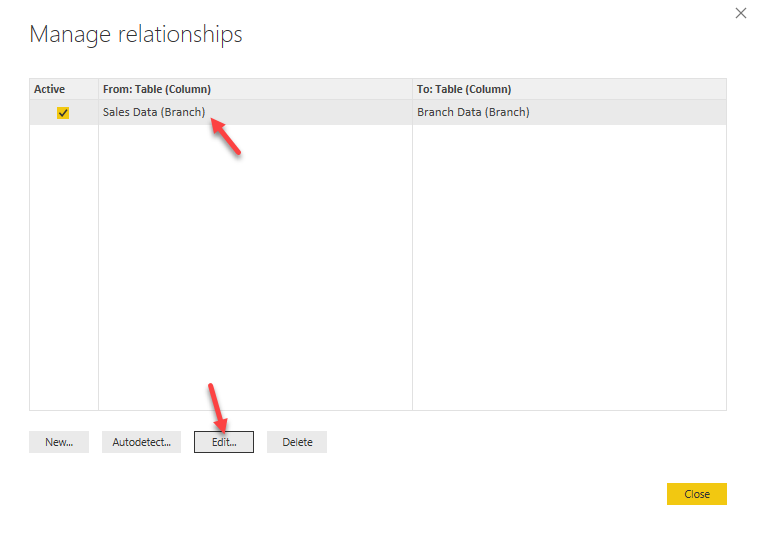
Double click on the line of the relationship it created for you (between Branch Data and Sales Data) and set it to Both direction. Single direction means you can go in one direction only: great if you have a database background and will always remember the direction, additionally it helps prevent ambiguity in the relationships (the main advantage that should make you consider it and the trouble of always remembering to go from the dimensioning table to the data table). Alternatively, you can click on Manage Relationships to edit and create new relationships.


We’ll create relationships between the other tables. Daily Target to Sales Data.


And Sales Target to Sales Data


 And below is what it would all look like when you are done.


Now it’s time to do some formula-ing. Or DAX-ing as Power BI uses Data Analysis Expressions (DAX). You can download the official Microsoft reference material for the DAX formulas here: http://download.microsoft.com/download/0/f/b/0fbfaa46-2bfd-478f-8e56-7bf3c672df9d/data%20analysis%20expressions%20-%20dax%20-%20reference.pdf

So head to the Data part (on the left) of the main Power BI window. And select the Sales Data table as we need to do some tasks on it.


The Sales Data has Price and Quantity field but no Sales Amount field. So we need to create that. And the good thing is that the formula syntax is similar to that in Excel, especially formulas in Excel Tables.

So we first create a new column, by rightclicking any field in the table and selecting New Column or clicking on New Column at the extreme right under the Home menu. Then change the name from the default “Column” to any name you find more appropriate.


Sales Amount = 'Sales Data'[Price]*'Sales Data'[Quantity]


One more cool thing. Change the Sales field and other money fields to Currency. I’ll select my country currency: Naira.


Now we go into the visual part of the report creation.

Click on Reports on the left part of the main Power BI window. And let’s start with a PivotTable-like report showing products against sales amount.


In Power BI, everything is a visual. Even a table is a visual. You have to pick the visual you want and drop the fields you need into the appropriate sections of the visual components.

Notice the similarity between the Matrix visual in Power BI and the PivotTable in Excel. If you ask me, I’ll say they are exactly same. So huge bonus for you if you already use PivotTable in Excel.


Since we are now done with the Sales by Product table, let’s put in a Slicer that acts as a filter on the Branch Manager.


I think it would look better if it displays horizontally. To change the look of any visual, you click on paint brush icon, you get a bouquet of options that lets you change everything from text size and color to structure of the visual. There I change the Orientation from Vertical to Horizontal.


Next is we add a Card that shows the total sales figure.


See how everything is a visual.

Now we add a Gauge that shows sales against target.


And you can change the type of calculations done on any field you use. Just click on the dropdown arrow beside the field name in the visual panel.


And now we add bar chart of sales by products against targets.


Let’s do a cool one now. Add a map visual.


And finally, we add a Pie Chart.


You might want to change the look of some or all of the visuals. You can even add a background image or colour to the white page.

See below what I did to the Slicer to improve its look.


You can also add images, shapes and text boxes to your report.


And we are done with our first report building from scratch.


Next phase is to publish it and share with our boss and colleagues.


If you’ve not signed in to your Power BI account, you will be prompted to.

Then you pick the workspace you want the report published to. In every Power BI account, there is a default workspace called My workspace. Workspaces are what you create when you want to collaborate with colleagues on a report. It allows for equal access to making changes to the report and those changes are propagated rather than limited to your own copy of the report. You create them from the online Power BI service (www.powerbi.com).


I chose My workspace.

Then click on the report link upon successful publishing.


And here is what the online published version is like.


 And you can do super cool stuffs like export the entire report as a PowerPoint deck or print or even publish as a web link that can be shared with anyone. Just click on File.


 You can also edit the visuals or add new ones, even on new report pages. Just click on Edit and you get access to the type of designer tools you already are familiar with in the Power BI software.


It is time we share our report with others. To do that we need to create a Dashboard and pin the visuals we want to show in that dashboard. Not to be confused, the user we share with can still access the entire report we created but the Dashboard is the first thing they see and interact with. It has extra cool features like Q&A that generates visual answers to questions, even the sharing we want to do can only be done from the Dashboard.


Just so you know, you can do the pinning that creates the dashboard from either the report view mode or the report edit mode.


To create the dashboard, lets pin the entire report. That is called Pin Live Page and you can see it at the upper right side above the report itself.


I pick New Dashboard and give it a name.


I can also pin any visual by clicking on the pin icon at the upper right edge of the visual. I will pin the map and the card.


And I choose an Existing Dashboard, picking the one I already created.


Now I can go see the Dashboard.

I expand Workspaces on the mid left and scroll to the dashboard I created.


And here it is.


See that it has all the things I pinned. You can move the visuals around to re-arrange them and can also adjust the size.

You can see in the screenshot below, the interesting features I hinted that it has.


It is time we shared the report with colleagues. I simply click on Share at the upper right and enter the email of those I want to share with. Just note that you can’t share with non-corporate email ids (no yahoo or gmail email addresses will be accepted by Power BI).


The Access tab (beside Share) allows you to remove people you’ve previously shared with or edit their access right.

You can also subscribe to receive daily emails when the dashboard is refreshed (usually means updated with new data).


You can also publish the entire dashboard, report and dataset as a content pack, or just the report and dataset, or just the dataset.


Let’s try out the Q&A. Ask it to show you Sales Amount by branch as bar chart


Lastly, let me take you through all the settings available for the report and dashboard you have just created. To the right of the dashboard name, click on the ellipsis (three dots), then click on Settings.


 In the page that will come up, you will see all the settings that control how you consume the reports from automatic scheduling of refresh to update the reports with new data without your manual intervention to sending you an email notification when a the report has been refreshed (data updated).

The first settings tab is General. Allows you to set privacy – whether to allow Microsoft get performance log from you or not. And Language, account closure, enable developer mode for coding custom visuals and enable ArcGIS Maps for Power BI.


The second settings tab is Dashboards. It allows you to set whether to enable Q&A and Dashboard tile flow (automatic adjusting of the visuals shape and size based on the screen size of the device you are using to access the dashboard).

It is good to make sure that you are configuring the settings for the right dashboard.


The third settings tab is Datasets. It allows you to schedule refresh which depends on you manually setting gateway connection if your datasets are not on a cloud or publicly accessible datasource/database. You will notice a yellow warning notice saying that you’ve not configured a data gateway for the data sources you used (this is because the Excel files we used as the data source are locally saved on our PC and not from a cloud or internet data source).


Once you configure a data gateway on your PC and register the Excel files as data sources housed in that gateway, the warning will go off and you can set the scheduled refresh.

You can allow Cortana to access your datasets relying on the Q&A feature of Power BI. Also, you can preset some Q&A questions.


The fourth settings tab is Workbooks. Power BI allows you to import Excel files as Workbooks. This is only possible from the web Power BI service.


The fifth settings tab is Alerts. It allows you manage the triggers you’ve set regarding some metrics/values reaching a threshold figure.


The last settings tab is Subscriptions. It allows you manage the email subscriptions you have to existing dashboards so that you get a daily notification once the dataset (ultimately, the report and dashboard) is refreshed (usually indicating new data added).


And so we have come to the end of our sample sales analysis report in Power BI.

Again, you can download the practice along files at https://drive.google.com/file/d/1FCEkyJvW4viszv9wo43QaljXI2ADpCDD/view?usp=sharing 

Sunday, December 31, 2017

New Year Gift: Get My Power BI For The Busy Professional Book For Free


As we go into the new year, 2018, I want to share with you for free my latest book: Power BI for the Busy Professional.

To let you have a glimpse of the value in it, below is the preface:


I started my data analysis career with Comviva – Airtel Africa creating daily, weekly, monthly and ad-hoc reports for the entire operations in the CRBT product unit across Africa. The company operated across ten countries in Africa then and I was creating between 11 and 30 reports daily. The company had just moved to Africa after Bharti Airtel acquired Zain Africa operations, so everything started from scratch – my colleagues and I had to build everything from scratch.

Power BI is the tool I wish we had then. I would have been able to automate all our reports with ability to drill down and drill through, allowed each country operations manager see only what is within their region/country while the big bosses overseeing the entire continent can see everything. I would not have needed to work on public holidays that were local to us since the other country guys needed their reports and were not on holidays.

Most importantly, I would have been able to build more insightful reports and ones focused on providing business intelligence, I would have had more time to do more strategic revenue improving activities rather than slaving away at recurrent reports making. And the management would always have all the data and reports they needed in a very interactive and real-time way.

This book is to give you what I lacked then; it is my own way of making it easy for you to learn and immediately start using Power BI without having to take a leave off work or risk migraines. I have used very easy to follow illustrations with a hands-on approach to ensure that it would be fun and easy for you. You are already a busy professional, this book is to fit perfectly into your life and not disrupt it.

And about me? I am a four-time Microsoft Most Valuable Professional (MVP) and the only one in my area of award in Africa. Helping people and companies make the most of their data is what I do full-time. I have also written books and created online courses that have been used by over 18,000 people across the world. You can connect with me on LinkedIn: https://www.linkedin.com/in/olafusimichael/


You can download the book from Amazon Kindle today for free at https://www.amazon.com/dp/B078NF5XYP or get the PDF version at https://drive.google.com/file/d/1Mj_LRdhZJhoX5A6AxpT3wNDWtKqKB86c/view?usp=sharing 


Enjoy! And a wonderful 2018 to you!

Saturday, December 9, 2017

Power BI #3: The Query Editor

When you launch the Power BI Desktop, the start up screen you get has Get Data on the top left side.


The Get Data is the your first window into the Query Editor. If you are familiar with Excel, the Query Editor is the exact replica of PowerQuery. 


In Power BI, it is your main data manipulation and data cleaning tool. Once you connect to the data you want to analyse, it is good to go to the Query Editor to examine the data and, if the data needs some cleaning or transformation, do all that transformation in the Query Editor.


Clicking on Edit, when done connecting to the data, takes you to the Query Editor, and I recommend you always use Edit rather than Load which brings in the entire data without allowing for preview and modification/transformation.

Below is what the Query Editor looks like and it always opens as a separate window from the main Power BI window.


The Query Editor can be divided into four functional sections.


1. Menu section
2. Queries section
3. Data Preview section, and
4. Query Settings section.

The Menu section is more like the control panel housing all the tools you will need for most of your data cleaning and data transformation processes. In the end, it is a section you will have to be very proficient at and we will do a lot of practical demonstration of real world analysis that involves using this section.

The Queries section mainly lists all the data sources you are connected to. Right-clicking on any of the data source gives you some very useful set of options.


The Data Preview section shows a preview of the data selected in the Queries section. This gives the Query Editor some advantages over loading the data directly into the Data model, especially in a case of a large data set that would take too many system resources and time to load. By loading just a preview, one can get working immediately on the data and even set filters and formulas to pull in just the segment of the data set that is needed rather than pulling in the entire data set. It also has some useful features — like filter, rename, delete, replace errors and others.


The Query Settings serves as a very interactive and feature-rich audit trail. It allows you to see all the transformation steps carried out in applied order. You can modify any step and re-order the steps if you want.


In future chapters we will do some real world analysis that will help us further dive into the Query Editor and see its practical usefulness.

Wednesday, November 29, 2017

Understanding The Practical Differences Between Excel 2011 for Mac, Excel 2016 for Mac and Excel for Windows

In our training classes, whenever I hear a participant say he can't find a particular menu item exactly where I pointed out then I suspect he is using Mac. And I am usually correct.


If you use the Mac version of Microsoft office, a lot of things are not the same as with the Windows version. In today's post I am going to show you the practical differences you should be aware of between the two common editions of the Mac version and the Windows version of Excel.

First of all, the verdict. My recommendations. 
  1. If you want to be a superb user of Excel for data analysis and master the new advanced tools in Excel, you will have to put aside the Mac versions of Excel. Either you get a Windows PC/laptop or create a Windows OS powered Virtual Machine on your Mac and install Excel on it. 
  2. If you already use Excel on Mac and are okay with not being able to do PowerQuery/PowerPivot, then go for Excel 2016 Mac edition. It is better designed and has more features than the Excel 2011 Mac edition (the edition before the 2016 one as Mac has no Excel 2013 edition). Microsoft has re-added the missing Macro/VBA features people complained about when migrating from Excel 2011 Mac to Excel 2016 Mac, so no reason to stay with the Excel 2011 anymore.

Excel 2011 for Mac


When Microsoft did Excel 2010 for Windows, they also made Excel 2011 for Mac. Unfortunately, their capabilities are not equal. Microsoft tried to give them both the same base features but when you want to do more, like work with Macros/VBA, enable add-ins like Analysis Toolpak or Solver, work with external data sources or do more with your PivotTable then you'll see that the Mac version is somewhat limited compared to the Windows one.

One main thing to note if you are already familiar with the Windows version of Excel is that the File>>Options menu is Excel>>Preferences in the Mac versions.


And if you want to enable the Developer menu, you'll click on Ribbon (last item in the last row) in Excel Preferences window.


Lastly, the menu on the Excel 2011 for Mac can be very confusing. They are two menu layers that you'll find yourself cycling between to locate commands/features you want to use. And it is much worse if you are already used to where things are placed in the Windows version.


Excel 2016 for Mac


Microsoft must have heard the complaints about the Excel 2011 for mac and how much people wanted similar experience and UI to the Windows version. They really did well with the Excel 2016 for Mac one. The menu items are arranged in the same way as in the Windows version. There is still the two menu layers confusion but less confusing than in the Excel 2011. The look is also very cool and mirrors the Windows one.

The main issues are still the advanced tools. And now, with the advent of PowerQuery, PowerPivot, PowerView and many more advanced features in the Excel 2016 for Windows (Office 365 one, especially), the Mac version is looking a lot more like a watered down version. 

Also, just like the Excel 2011 for Mac, the File>>Options menu is accessible as Excel>>Preferences in the Excel 2016 for Mac version.


And those are the practical differences I find between the Mac versions and the Windows version. 

If you would like to read something more official from Microsoft, then head over to https://support.office.com/en-us/article/Compare-Excel-for-Mac-2011-with-Excel-2016-for-Mac-602a6c30-e6a6-47c5-9e0d-b16af397427a (for the comparison between the 2011 and 2016 editions of the Mac versions) and https://support.office.com/en-us/article/Compare-Excel-2016-for-Mac-with-Excel-2013-for-Windows-1b24f293-739c-4120-b884-893b6687e0d0 (for the comparison between Mac and Windows version of Excel).


What are your thoughts?

Wednesday, November 15, 2017

Recorded Video of the Webinar On What-If-Analysis (Goal Seek, Scenario Manager, Data Table) and Solver in Excel


If you missed the live broadcast of the webinar, below is the link to the YouTube recording: https://www.youtube.com/watch?v=eE1yV9RNIko


We covered the following:
  1. How to use Goal Seek to plan towards achieving a specific target/goal. I used four different examples to demonstrate the power of Goal Seek, from business loan planning to product break-even quantity analysis.
  2. How to handle different scenarios and plan more proactively using Scenario Manager. I gave an illustration of how the Nigerian budget office creates scenarios around the crude oil price. The benchmark price they publish in the annual budget that is approved is just one of the many possible average prices of crude oil that they have run the budget through. It helps them put in place the processes and plans that might be drawn on if prices go too far off the benchmark value. Then I demoed how I use it for training planning, to measure the profitability of any training class based on best case, likely case and worst case scenarios.
  3. How to use Data Table to plan more flexibly. It allows you to monitor the results for multiple combinations of changes in two input variables/parameters. I demoed how it would help with determining the profitable price and number of participants combination for a training class idea.
  4. Finally, I showed us how to enable and use Solver for optimization analysis in business. Maybe you want to make the most of your shift workers or run your factory machines more productively or maximize profit margin or minimize costs, once you can outline your business in numbers in Excel linking the inputs to outputs, Solver will do the rest. I demoed how an FMCG uses it to determine how to supply its distributors from their warehouses in such a way that they minimize the freight cost.
You should watch the recorded session: https://www.youtube.com/watch?v=eE1yV9RNIko