Showing posts with label analysis. Show all posts

Monday, November 19, 2018

How To Scrape Data From A Website Into Power BI (AbokiFX as an example)

Power BI is an amazing tool. I have used it to create amazing auto-updating dashboards for different reporting needs. You can view a couple that I made publicly available: https://www.nigerianelite.com/Shares/Analysishttps://community.powerbi.com/t5/Data-Stories-Gallery/Sales-Dashboard-for-a-Pizza-Restaurant/m-p/509025#M2208 and https://community.powerbi.com/t5/Data-Stories-Gallery/Nigerian-Stocks-Market-Analysis-Live-Report/m-p/175769#M850

Today, however, I will be showing you how to use Power BI to scrape data from a website and create a report/dashboard from the scrapped data. I will illustrate with AbokiFX.com data on parallel market FX rates for Nigeria. Effectively, you will be creating a report like the one below:


STEP 1
From an empty Power BI desktop file, do Get Data and pick from Web (under Other).


Follow through with providing the URL of the website to pick data from and selecting the table of data to pull into Power BI.


STEP 2
Do a couple of transformation on the data (except you are very lucky that the pulled data is already in a form that suits your report).


STEP 3
Create the report you want and publish.


You may also want to configure a scheduled refresh to make Power BI keep pulling new data from the website everyday.

Tuesday, April 25, 2017

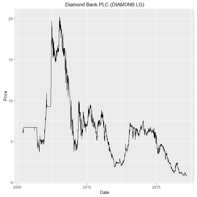
Analyzing Nigeria Stock Market, Bond Yield, Exchange Rate and GDP Using R

Today I decided to do an interesting analysis using R. I compiled actual/live data from as far as 1998 on Nigerian All Share Index and 48 of the most valuable stocks. You can access the raw data here: https://drive.google.com/open?id=0B4XKk-Dstn-eVjRMQ0hQR0hvQ3c

Here is the R code text.


# Load in necessary libraries
require(ggplot2)
require(lubridate)

nse_asi<- csv="" data_analysis="" font="" read.csv="">
nse_asi$Date<- ate="" font="" mdy="" nse_asi="">

# Uncomment the following lines to see the structure and preview of the raw data
#str(nse_asi)
#summary(nse_asi)
#head(nse_asi)


# This next lines of code are to generate the charts for each company in a separate window
# It is not compulsory, and might be worth commenting out if it makes your computer freeze
for (cmpy in unique(nse_asi$Company)){
  dev.new()
  print(ggplot(data=nse_asi[nse_asi$Company==cmpy,], aes(x=Date, y=Last_Price))+
  geom_line() +
  ggtitle(cmpy) +
  labs(x="Date",y="Price") )
}

# This is the most important chart code. Generates the charts in a neatly grouped way
ggplot(data=nse_asi, aes(x=Date, y=Last_Price, group=Ticker, color=Ticker))+
  geom_line() +
  facet_wrap(~Ticker,scales="free") +
  labs(x="Date",y="Price") +
  theme(legend.position="none")


And below are the results. Enjoy. Lots of screenshots. And make sure you notice the interesting insights: like how investors in Presco, Okomu Oil, United Capitals and Mobil would have been smiling to the bank despite the market depression and economic recession. I personally made some gain from Mobil. Also notice how not very long ago, 1 USD exchanged for 22 Naira.

NSE ASI (pointed out with the red line) and 48 top stocks

FGN 10 Year Bond Yield

Nigeria Real GDP Growth from 1960 till Today

US Dollar to Nigerian Naira Exchange rate